Elevated. Not distant.
Specialty coffee branding has a trap: lean too hard into the craft aesthetic and you lose the warmth that makes people actually want to spend time with a brand. Maven needed to feel like it knew its stuff without making you feel like it was testing you. The line between confident and cold is thin, and the whole project lived right on it.
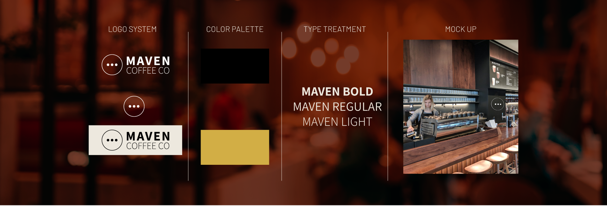
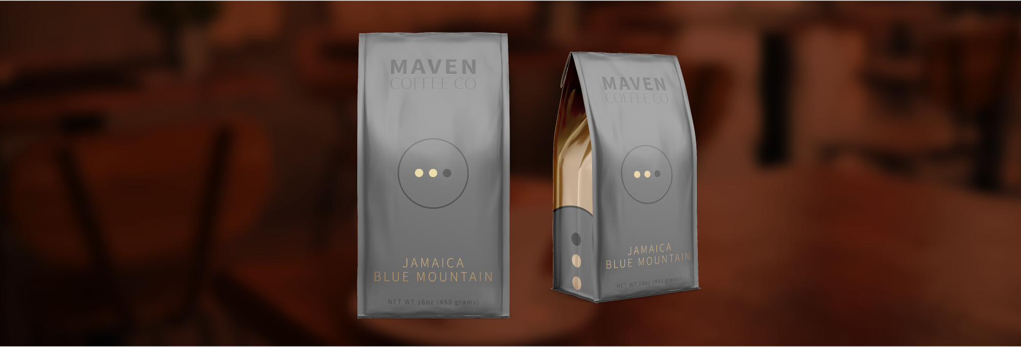
I grounded the identity in rich, warm tones that signal quality without demanding attention. The mark was built to work at every scale, from a subtle emboss on a bag to a bold lockup on packaging. The type choices balanced elegance with legibility, because packaging that looks beautiful but can't be read isn't doing its job. Every decision came back to the same question: does this feel like somewhere worth going back to?
The answer is yes. That's the job.
What was built.
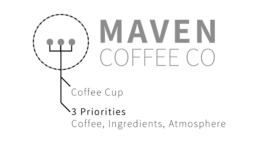
- Logo System & Brand Mark
- Color Palette & Typography
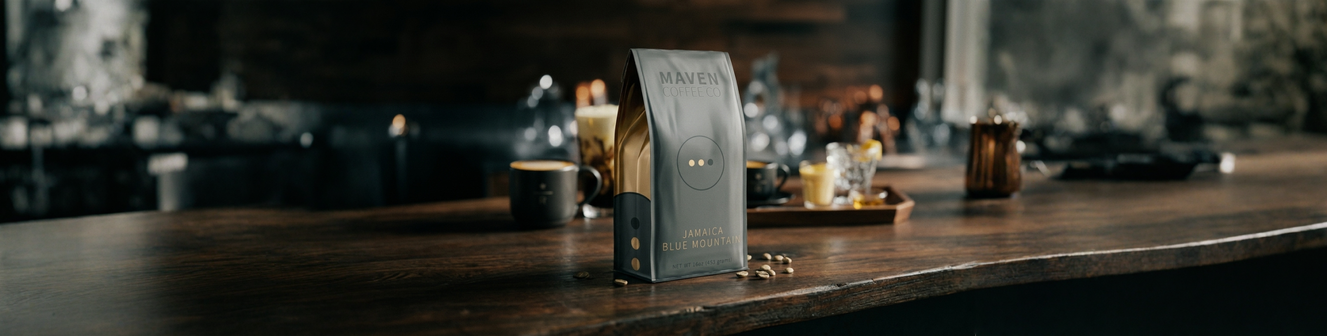
- Coffee Bag & Packaging Design
- Print-Ready Production Files