The mission is the brand.
The hardest thing to design around is a story this good. Three Avocados has a name that stops people mid-sentence, a mission that makes you want to get involved, and a product — coffee — that people already feel something about. The challenge wasn't creating meaning. It was getting out of the way of the meaning that was already there.
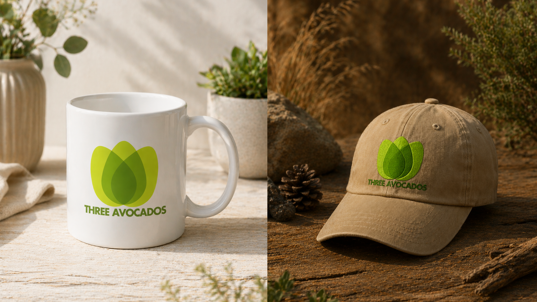
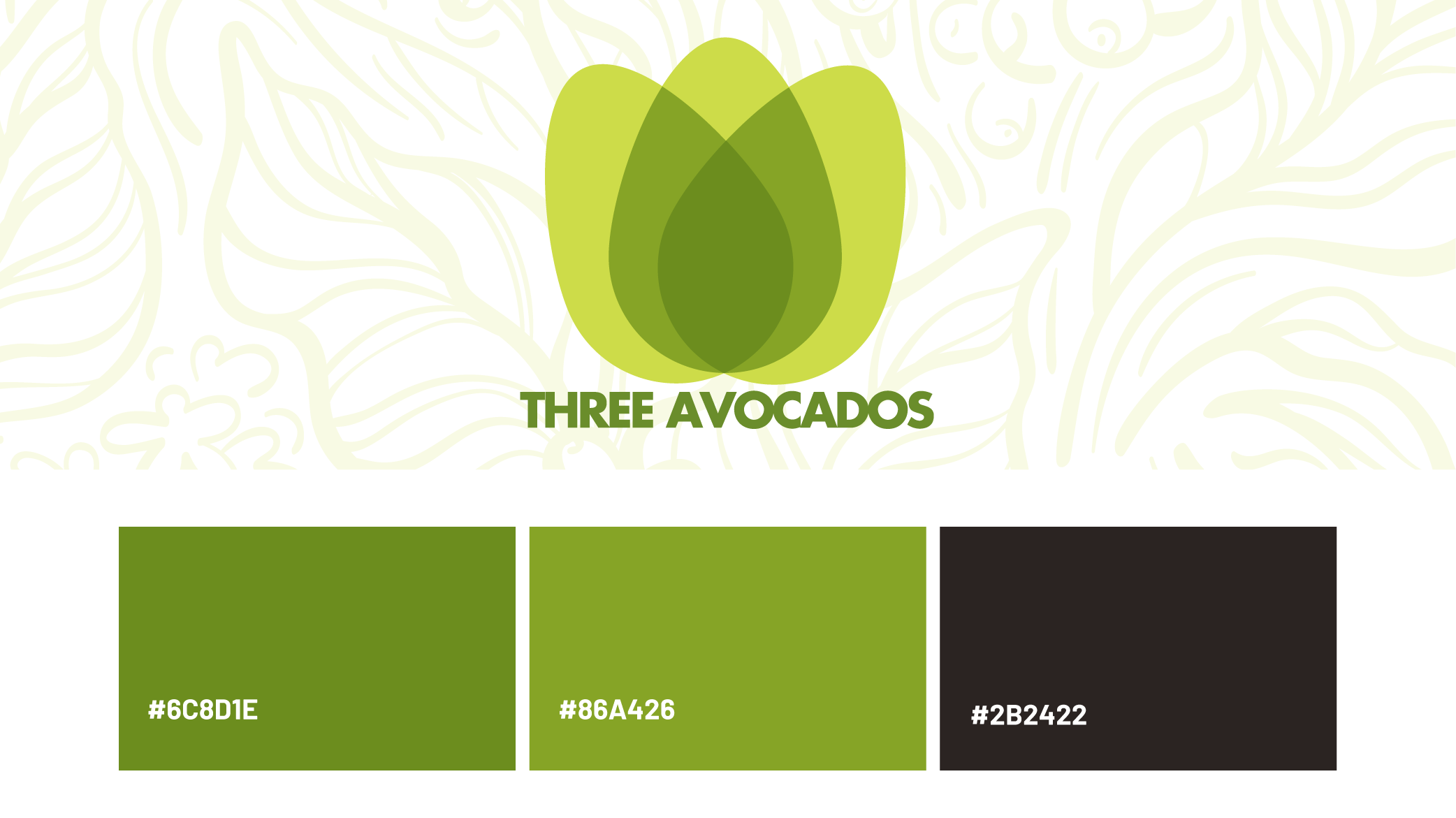
I built an identity rooted in warmth and honesty. Earthy tones that nod to the land the coffee comes from. A mark that feels handcrafted without trying too hard. Typography that reads as genuine, not polished to the point of distance. The goal was a brand that could live on a coffee bag, a donor mailer, or a social post — and feel equally at home in all three.
When every purchase funds something real, the brand has to make people feel that. Not through heavy-handed messaging, but through the quiet confidence of something designed with intention.
What was crafted.
- Logo System & Brand Mark
- Color Palette & Typography
- Brand Guidelines Document
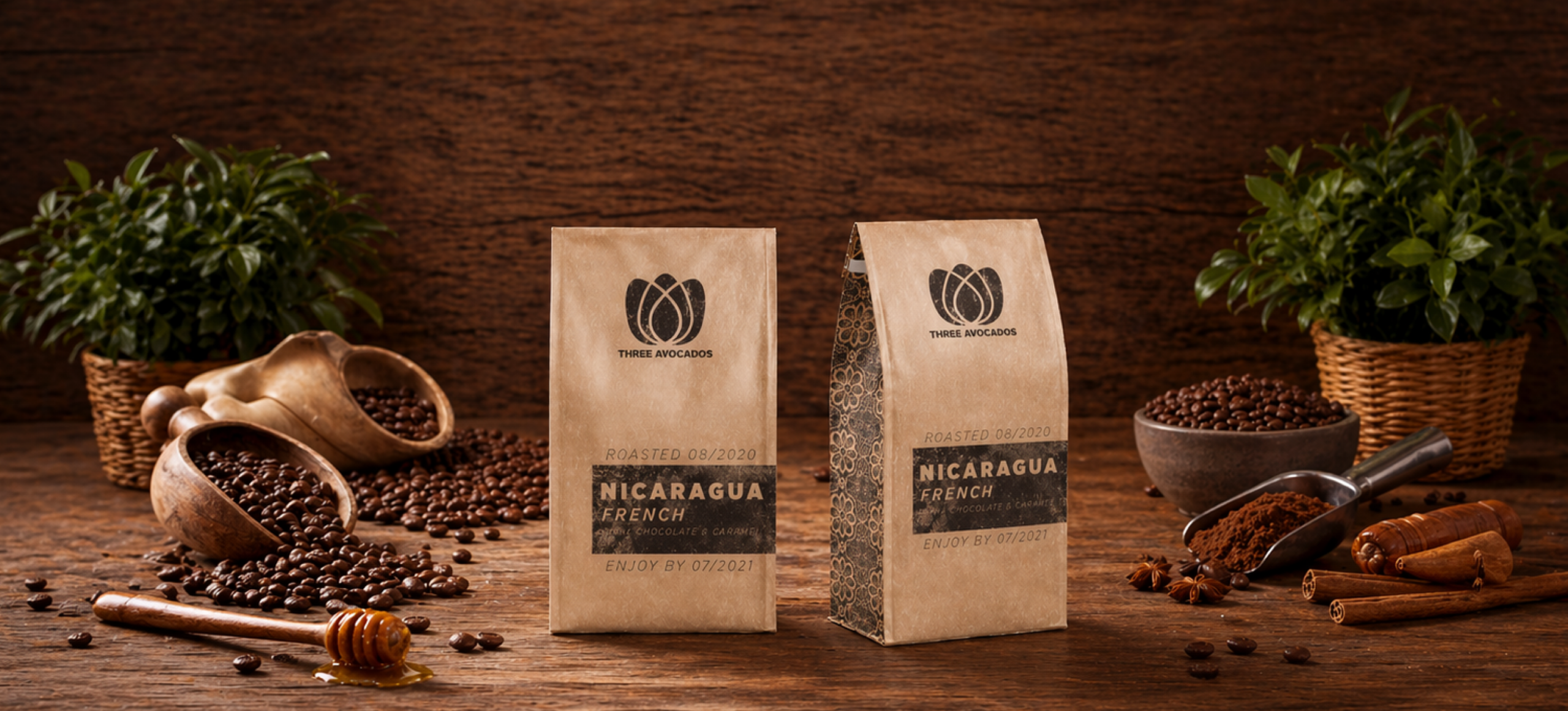
- Coffee Bag & Label Design
- Donor & Outreach Materials
- Business Card & Stationery
- Social Media Asset Kit
- Print-Ready Production Files