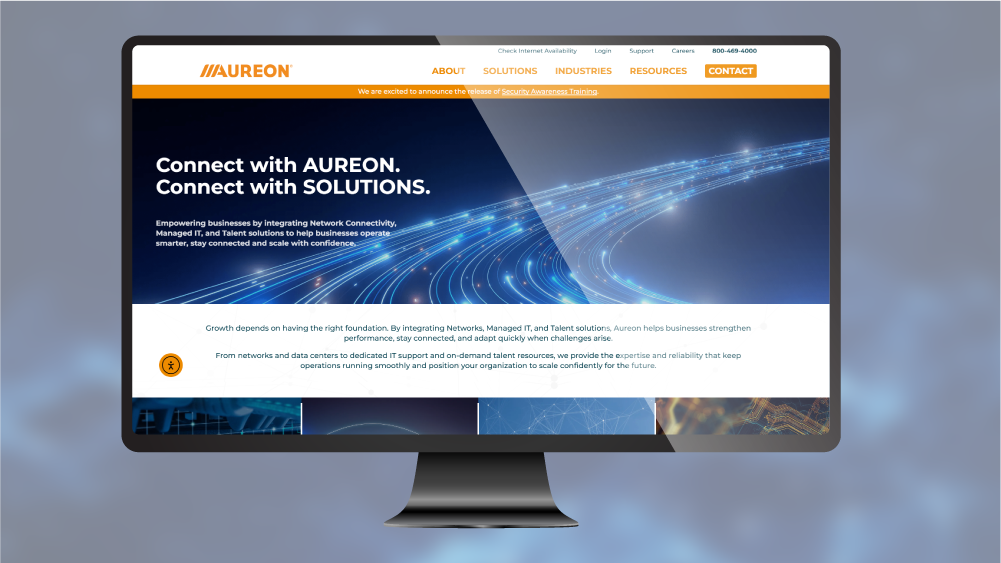
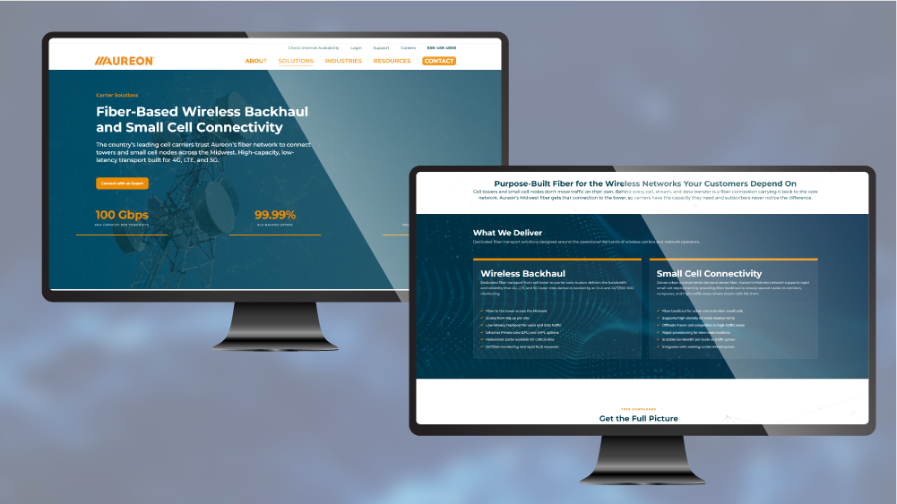
Forty years in, Aureon needed to look the part. A leading Iowa provider of telecommunications, internet, managed IT, data transport, and customer support solutions, Aureon had outgrown its old identity. The brand no longer matched the scale, sophistication, or reach of the business it had become. I led a full rebrand from the ground up: new logo, refined visual system, a redesigned website, and a suite of digital and print materials that now reach thousands of people every month.
Built to Scale.


40 years. Rebuilt.
Aureon had the history, the client relationships, and the expertise. What they needed was a brand that communicated all of that at a glance. The old identity had served them, but the business had grown into something bigger and the visuals hadn't kept up.
I refined the visual system: a tightened color palette, consistent application across every touchpoint, and a tone that balanced corporate credibility with genuine approachability. Every decision was made to reflect who Aureon actually is, not just what a technology company is supposed to look like.
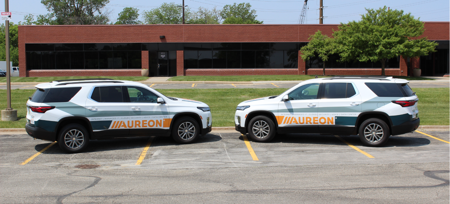
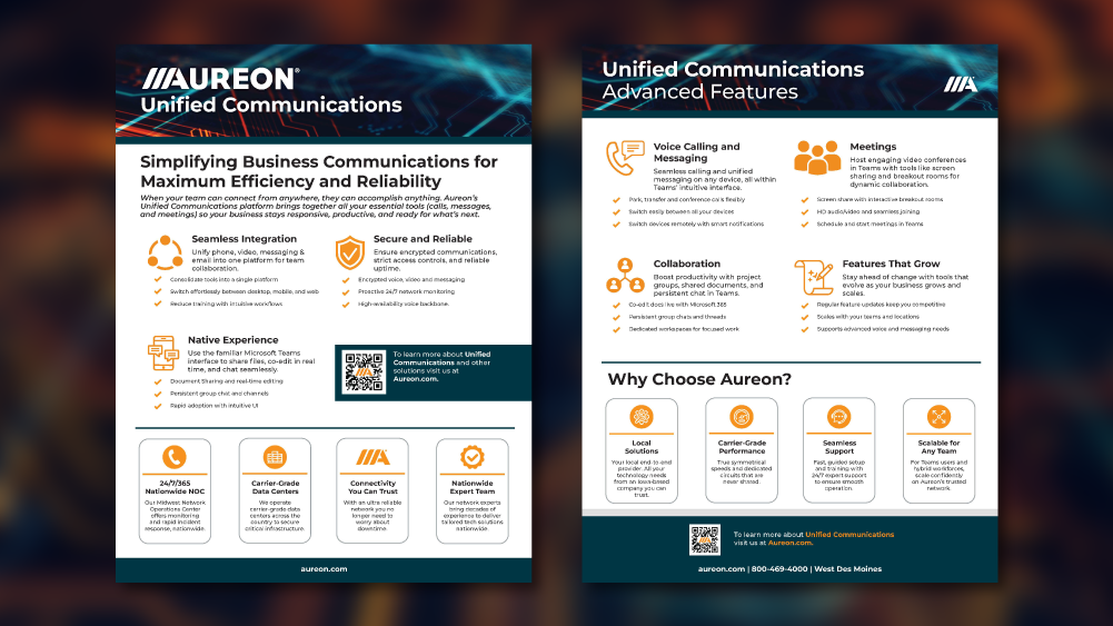
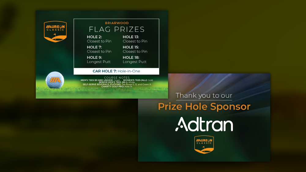
The new website became the centerpiece, visited by thousands every month and built to convert. Vehicle graphics, sell sheets, digital ad templates, and presentation decks followed. The result is a system that works everywhere, from a vehicle on I-235 to a pitch deck in a boardroom.
What was built.
- Color Palette
- Brand Guidelines Document
- Website Design & Development
- Vehicle Wrap Graphics
- Sell Sheets & Sales Collateral
- Digital Ad Templates
- Presentation Deck Template
- Social Media Asset Kit
- Print-Ready Production Files