

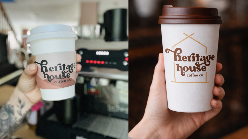
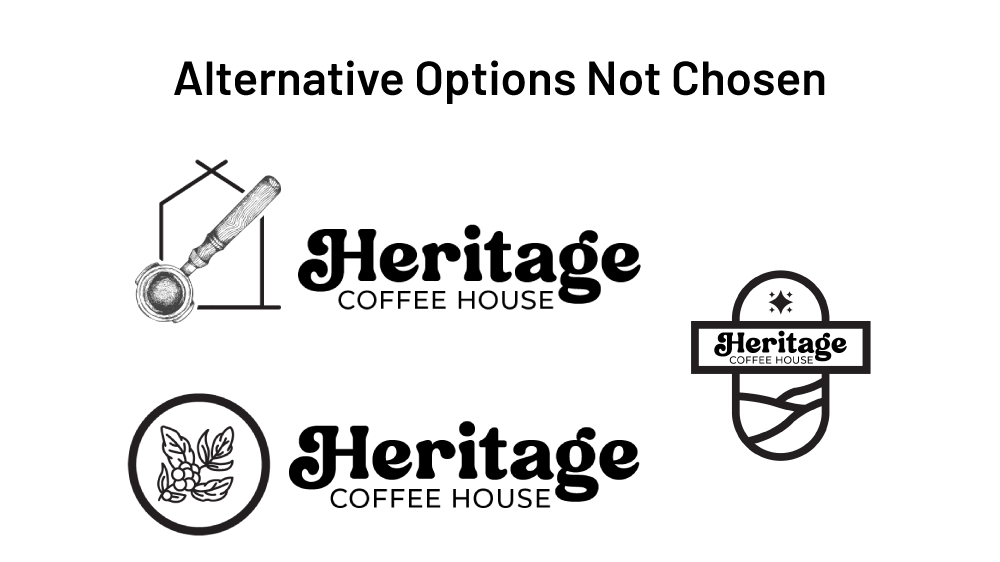
Evolve, don't erase.
The worst thing you can do to a logo with history is blow it up and start over. Heritage Coffee had equity in their mark — recognition built over years of early mornings, loyal customers, and good coffee. The job wasn't to fix something broken. It was to sharpen something that had gone a little soft.
I looked at what was working and what wasn't. The proportions needed adjusting. The letterforms needed tightening. The weight distribution needed to feel more intentional. None of it was dramatic, but every single change was deliberate. That's the discipline of a logo refresh: knowing which 10% to change so the other 90% lands harder.
The result is a mark that feels like it's always looked this good. Familiar to the regulars. Credible to newcomers. That's exactly where it needed to be.
What was refined.
- Logo Refinement & Brand Mark