
Corbel Architecture.
A name built into the walls of architecture — a brand built to match. Corbel Architecture came to Dropcap with a firm that was doing serious work but carrying an identity that didn't reflect it. The name itself is borrowed from architecture: a corbel bears weight so the structure above it can stand. The brand needed to do the same — carry the firm's credibility and precision into every touchpoint, from a business card to a pitch meeting.
Precision built in.
Identity. Structured.
Architecture is precision by nature. The challenge wasn't to make Corbel look like an architecture firm — it was to make them look like the right architecture firm. The old identity was doing the job on paper, but it wasn't carrying the weight of the work happening behind it.
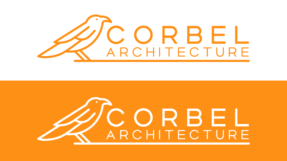
I approached the brand the same way an architect approaches a building: with intention at every decision point. The logo was built for longevity, not trend. The color system is grounded and authoritative. The typography has the kind of clarity you'd expect from a firm that thinks carefully about space and form. Every element was chosen to reflect how Corbel actually works, not just what an architecture brand is supposed to look like.
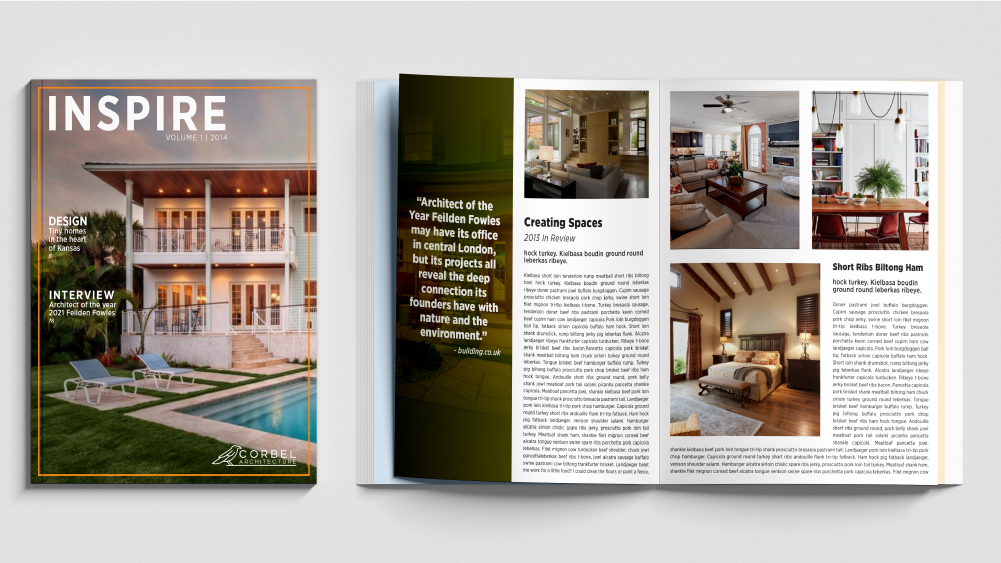
The result is an identity system that shows up consistently across every touchpoint — from the first impression of a business card to the closing slide of a pitch deck.
What was built.
- Logo System & Brand Mark
- Color Palette & Typography
- Brand Guidelines Document
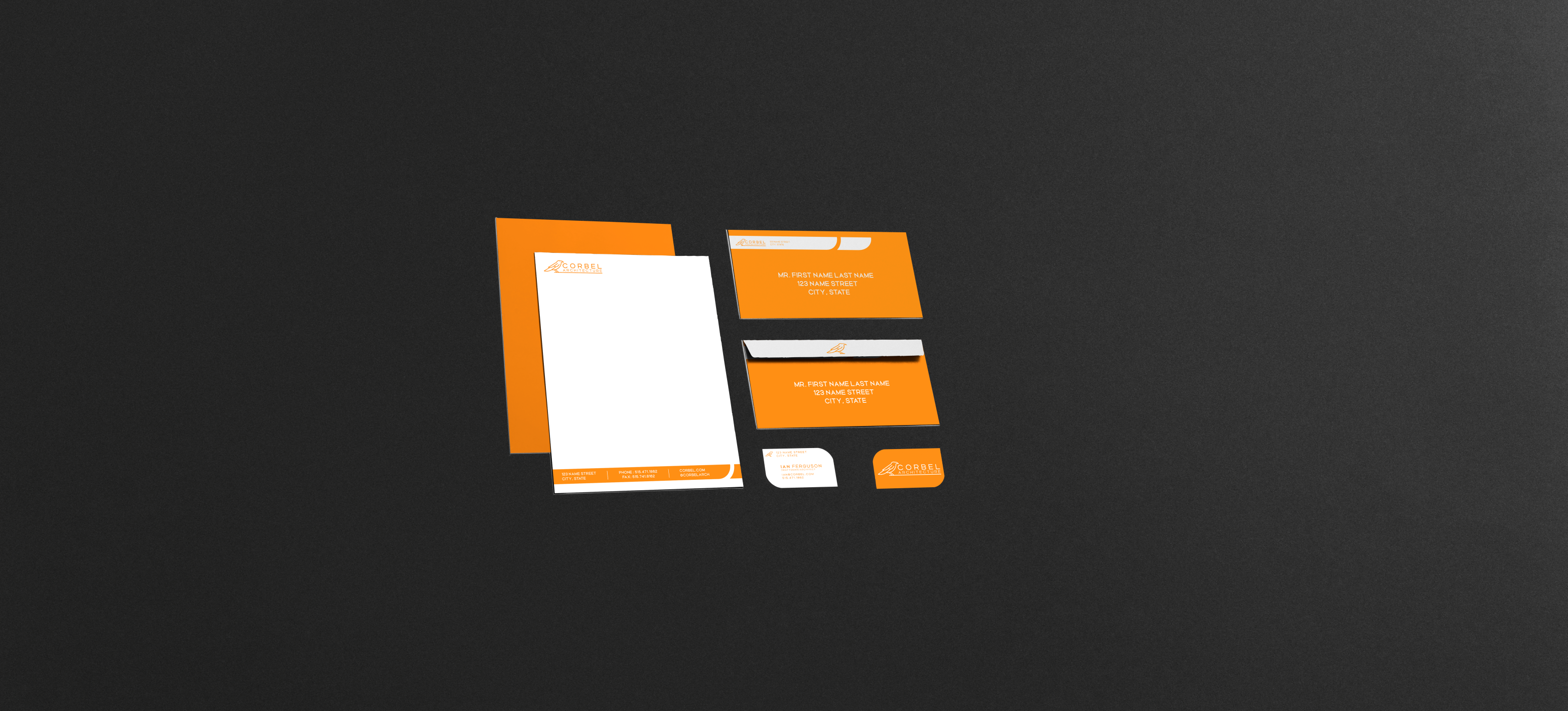
- Business Card & Stationery System
- Email Signature
- Presentation Deck Template
- Social Media Asset Kit
- Print-Ready Production Files